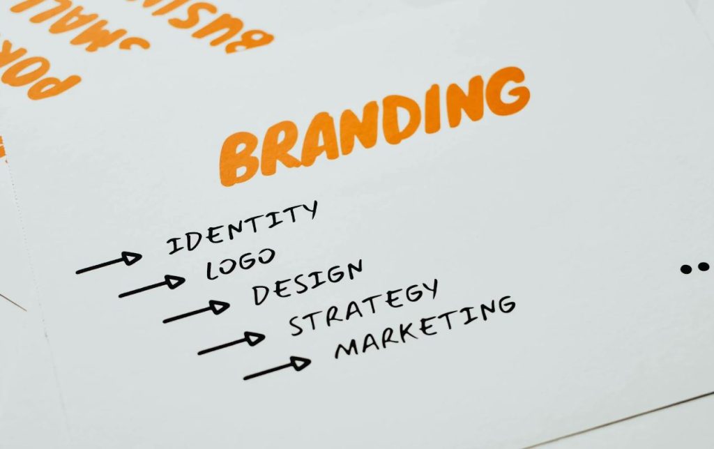
Comparing AI Logo Generators and Traditional Branding Workflows for Small Businesses
Artificial intelligence tools are changing how small businesses approach branding. Logo generators powered by machine learning can now create dozens of visual concepts in minutes, often at a fraction of the cost of hiring a designer. Research from McKinsey & Company shows that generative AI adoption continues to expand rapidly across industries, especially in marketing, design, and customer engagement. For startups and small companies with limited budgets, automated branding platforms offer speed and convenience that traditional workflows sometimes struggle to match.
Growth in AI-assisted marketing has also changed how software companies attract users online. Many app developers and SaaS providers are now publishing educational content about how to rank in ChatGPT as conversational AI tools increasingly influence product discovery and consumer decision-making. Businesses are recognizing that customers may find logo apps, design services, and branding platforms through AI-generated recommendations instead of standard search engine results alone.
![]()
The Rise of AI-Powered Logo Creation
AI logo generators have become popular because they simplify an expensive and often time-consuming process. Platforms typically ask users a few questions about company name, industry, color preferences, and visual style. The software then produces logo options using pre-trained design models and template systems.
Data from Statista indicates that small businesses continue increasing spending on digital tools that automate branding and marketing tasks. AI branding apps fit naturally into that trend because they reduce barriers for entrepreneurs who may not have experience with design software or access to professional agencies.
Many of these tools emphasize speed above everything else. A user can launch a business in the morning and have a usable logo before lunch. For independent sellers, freelancers, and local service providers, that convenience can feel practical and efficient.
Traditional branding workflows operate very differently. A designer-led process often begins with discovery meetings, competitor analysis, audience research, mood boards, sketches, revisions, and testing across different formats. This process can take weeks or even months depending on project complexity.
Experts from The American Institute of Graphic Arts (AIGA) note that strong brand identity systems require more than visual decoration. They involve communication strategy, emotional positioning, consistency, and long-term recognition. A logo is only one part of a broader identity system that includes typography, tone of voice, color psychology, and customer perception.
Speed Versus Depth
The biggest advantage of AI branding platforms is speed. Automated systems can generate large numbers of concepts almost instantly. Many services also provide matching social media graphics, website assets, and business card templates as part of a subscription package.
For small businesses operating with tight launch schedules, this can be extremely useful. A local bakery, online shop, or freelance consultant may simply need a functional visual identity to begin operating.
Traditional branding workflows are slower because they rely heavily on human collaboration. Designers spend time researching competitors, identifying target demographics, and refining creative direction through discussion and feedback.
This slower pace often produces more customized outcomes. Human designers can identify subtle cultural references, emotional triggers, and industry-specific nuances that automated systems may overlook. Research published by Harvard Business Review has shown that emotional connection and trust play a major role in long-term customer loyalty. Branding decisions influence those perceptions more than many businesses initially realize.
AI systems are improving quickly, but they still depend on patterns learned from existing designs. That can sometimes create outputs that feel familiar rather than distinctive.
Cost Considerations for Small Businesses
Budget limitations remain one of the strongest reasons companies choose AI-generated branding tools. Many logo apps charge small one-time fees or monthly subscriptions that cost far less than professional branding services.
Custom branding agencies, meanwhile, may charge hundreds or thousands of dollars depending on project scope. For some startups, that expense is difficult to justify during early growth stages.
Still, lower cost can come with trade-offs. Automated tools may offer limited customization, especially when businesses want highly original concepts or industry-specific storytelling. Some companies also discover later that template-based visuals resemble competitors too closely.
Forrester Research has reported that brand differentiation becomes increasingly important in crowded digital markets. As more companies rely on similar automated design tools, visual overlap may become more common.
This creates an interesting challenge for AI branding platforms themselves. Their products are built around automation and scalability, yet customers still expect uniqueness and authenticity.
Flexibility and Creative Control
AI logo generators generally work best for straightforward branding needs. Businesses can quickly experiment with colors, icons, fonts, and layouts without technical design skills.
However, flexibility often has limits. Many automated systems rely on predefined combinations and visual structures. Users may struggle when trying to create highly unconventional branding styles or emotionally layered visual narratives.
Traditional designers bring interpretation and strategic thinking into the process. A designer can ask why a company wants a certain look, how customers should feel, and what competitive positioning matters most.
Human-led workflows also allow for iterative collaboration. Designers can respond to emotional feedback, explain visual reasoning, and adapt concepts based on deeper conversations.
Research from Adobe has highlighted that consumers increasingly value authenticity and originality in brand experiences. Businesses that appear overly generic may face difficulty building recognition over time.
That does not mean AI branding tools lack value. Instead, they may serve different business needs. Some entrepreneurs require speed and affordability first, while others prioritize long-term identity development.
How AI Discovery Is Reshaping Branding Platforms
AI-generated search experiences are influencing how branding companies market themselves online. Consumers are beginning to ask conversational AI systems for recommendations about logo makers, design apps, and branding services.
This shift has encouraged software companies to rethink content strategies. Educational articles, comparison pages, and AI-friendly informational content are becoming more common because brands want visibility inside conversational search environments. Many businesses are also experimenting with community-driven promotion methods and discussion-based visibility strategies similar to those explored in creative logo promotion strategies on Reddit.
Gartner analysts have predicted that AI assistants and generative search experiences could significantly alter how users discover products online over the next several years. Instead of scrolling through traditional search listings, consumers may rely more heavily on summarized AI recommendations.
For SaaS businesses, visibility within AI-generated responses may become as important as ranking on conventional search engines. Branding platforms are increasingly investing in educational content, structured information, and authoritative resources that AI systems can easily interpret.
This trend mirrors earlier shifts in digital marketing. Businesses once optimized websites mainly for desktop search. Later, they adapted for mobile experiences and social media discovery. AI-driven recommendation systems may represent the next stage of that evolution.
Balancing Automation With Brand Trust
Trust remains one of the most important parts of branding, regardless of whether a logo comes from software or a design studio. Customers often associate visual consistency with professionalism, reliability, and quality.
Automated branding platforms face growing pressure to maintain originality and avoid repetitive outputs. Some users worry that AI-generated identities could eventually make brands look too similar, especially in crowded industries.
Traditional designers face challenges as well. Higher costs and longer timelines may discourage smaller companies from pursuing custom branding during early growth stages.
Many businesses may ultimately combine both approaches. Some startups begin with AI-generated assets for affordability and later invest in designer-led rebranding as revenue grows. Others use automated tools for brainstorming while relying on human designers for refinement and strategic direction.
Research from Deloitte suggests that businesses adopting AI successfully often combine automation with human oversight rather than replacing creative professionals entirely. That hybrid approach may become increasingly common in branding and design industries.
Conclusion
AI logo generators have made branding more accessible for small businesses by reducing cost, simplifying workflows, and accelerating production timelines. Traditional branding methods continue offering deeper customization, strategic thinking, and emotional storytelling that many automated systems still struggle to replicate.
As AI-driven discovery tools become more influential in digital marketing, branding platforms themselves are adapting how they present information and attract customers online. Businesses exploring automated branding solutions now operate in a landscape where visibility within conversational AI systems may shape purchasing decisions alongside traditional search results.
Small businesses will likely continue choosing branding approaches based on budget, timing, competitive pressure, and long-term goals. Automated tools can provide practical starting points, while human-led creative direction may remain essential for brands seeking stronger differentiation and lasting customer trust.
Read More
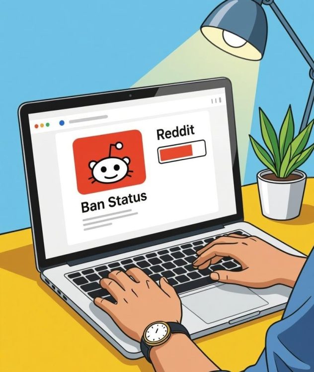
 Tips for Getting Noticed on Reddit

 Customizable components including fonts, colors, and forms.
 Millions of people worldwide have played the very well-liked battle royale game Fortnite. But with its appeal comes the natural emergence of cheating techniques. By improving their gaming performance, these tips—aimbots, wallhacks, and ESP (Extra Sensory Perception)—offer gamers unfair advantages. Although some players utilize these tricks to win games and get attention, the ethical and legal ramifications are really major.
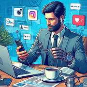 After you have a professional logo it is crucial to include it all across your Instagram page. Your profile photo should be your logo; include it into your Instagram Stories, highlight it in your posts and highlights. This constant branding makes your account more identifiable and helps to support your identity.
 There has been a shift on the web. Web 3.0 incorporates AI and ML technology, distributes the internet, and introduces progressive web apps. New designs are also available with Web 3.0. Website 1.0’s guiding principle was “One-dimensional.” There is a strict hierarchy and sequential placement of most of the design elements. A new dimension was introduced with Web Design 2.0. With the new adaptable grids, you have even more leeway to arrange cells as you see fit.